How I Built The Most Accurate Data Display And Analysis Web App For UHF And VHF Signals

This is Part 1. Read Part 2: From Hata to Longley-Rice - where we replace smooth prediction circles with real terrain-aware coverage using the ITM propagation model.
New here?
Hey, I'm George. I study Electrical Engineering and I love solving complex data problems. I build everything from barcode scanners to full AI-integrated analysis platforms like the one you're about to read about.
I use AI as part of my workflow, the same way I use a debugger or a calculator. It helps me move faster, but I read every line, understand the math, and make my own corrections. The engineering decisions, the debugging, the architecture? That's all me. AI is a tool, not a replacement for knowing what you're building.
If you enjoy this or learn something new, let me know. I'd love to hear what topics interest you.
Let's get into it.
What you'll learn from this post:
- How LTTB downsampling works (and why min-max failed)
- Free Space Path Loss (FSPL): the formula, its flaws, and how I tweaked the path loss exponent
- How to convert ATSC 3.0 channel numbers to frequencies in code
- The Hata-Okumura propagation model with urban, suburban, and rural corrections
- How to scrape and use FCC directional antenna patterns
- NLCD terrain classification mapped to propagation environments
- The additive terrain attenuation method (and why weight-averaging flattened my results)
- How caching + terrain pre-fetching cut load time from 8 minutes to 10 seconds
Tech stack: Vanilla JavaScript, Google Maps API, Chart.js, Bootstrap, Python API backend, NLCD terrain data (1.44GB), FCC broadcast database.
Circles On A Map
One of our clients sent an email with a log file from a drive test attached. He had all this signal data: GPS coordinates, signal strength in dBm, modulation error ratios, bit error rates, shoulder measurements, frequency shifts. Basically every metric an RF engineer could dream of.
And he wanted to properly analyze this data.
So... He reached out to us.
An engineer at my company had already built a basic template in a couple of hours. Google Maps integration, circles on the map showing drive test paths, circle sizes that varied by signal strength.
Here's what the original code looked like:
// Phase 0 - Simple markers sized by signal value
// That's ALL this did. No predictions, no analysis.
function displayMapValue(fieldName, minmax, dataset, color) {
    if (!map) return;

    const min_pixel_radius = 8;   // minimum circle size in pixels
    const max_pixel_radius = 25;  // maximum circle size in pixels

    dataset.map((item, i) => {
        const gps_pos = new google.maps.LatLng(item.lat, item.lng);

        // Normalize value between min and max to get pixel radius
        const pixelRadius = minmax.min !== minmax.max
            ? min_pixel_radius + ((item.value - minmax.min) / (minmax.max - minmax.min))
              * (max_pixel_radius - min_pixel_radius)
            : min_pixel_radius;

        // Create SVG circle symbol (pixel-based, doesn't scale with zoom)
        const circleSymbol = {
            path: google.maps.SymbolPath.CIRCLE,
            scale: pixelRadius,
            fillColor: color,
            fillOpacity: 0.35,
            strokeColor: color,
            strokeOpacity: 0.8,
            strokeWeight: 2
        };

        const itemMarker = new google.maps.Marker({
            position: gps_pos,
            map,
            icon: circleSymbol
        });
    });
}
That's it. Bigger value = bigger circle. No station data, no predictions, no physics. Just dots on a map.
I got the task to "make it better."
Perfect. Exactly what I wanted.
Because I love computer science. I taught myself most of what I know, and every problem I solve teaches me more than any textbook could.
The Option Parser
The first problem was obvious.
Every measurement was displayed at once. All overlapping. All confusing. Like stacking 15 transparent maps on top of each other and expecting someone to read them.
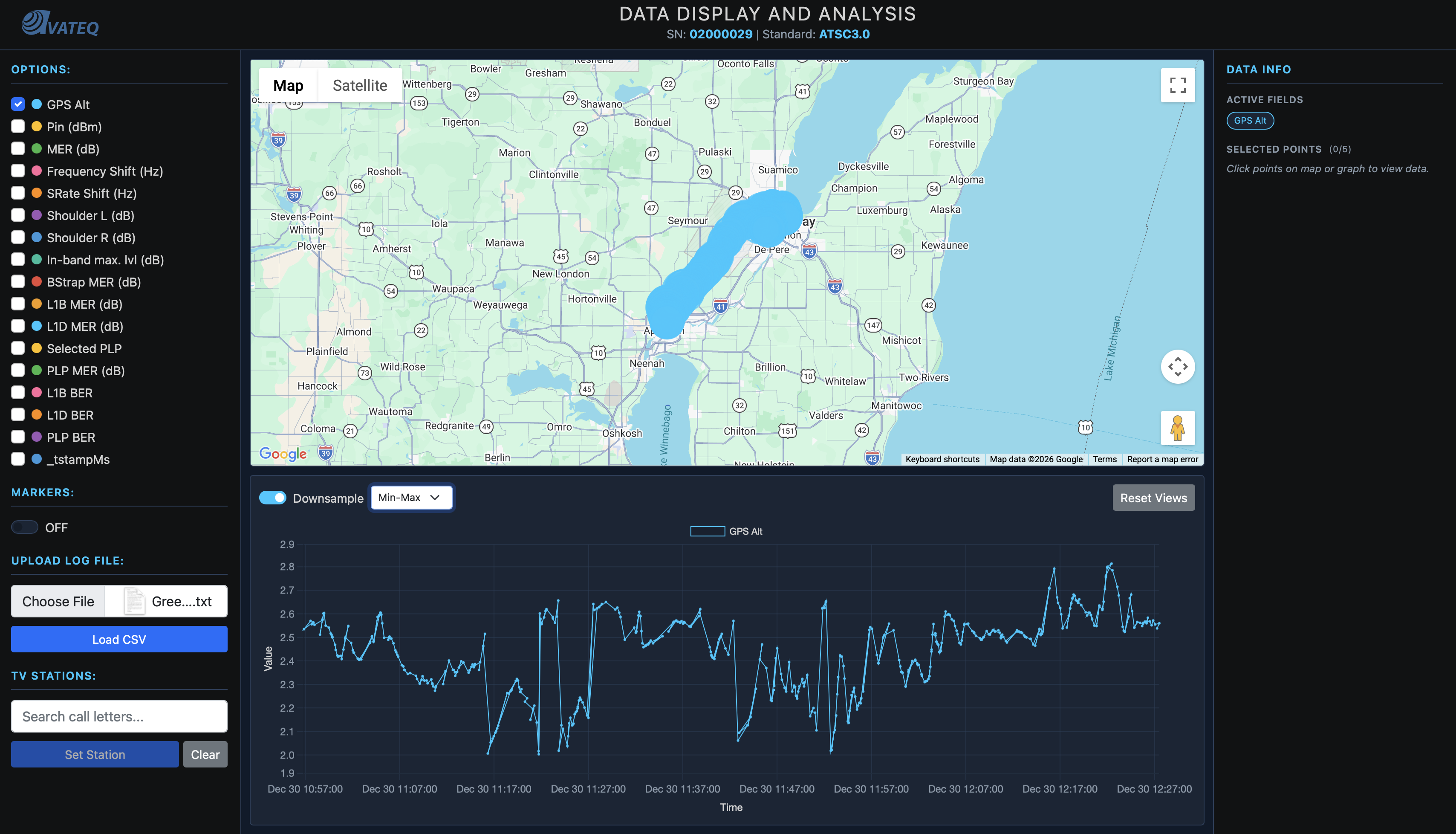
So I built an option parser, a way to split data by measurement type. Now users could select specific metrics one by one. Check each data point's measurements at different GPS locations. Toggle between different signal parameters.
No hierarchy yet. No "Essential vs Troubleshooting" tiers. Just the ability to look at one thing at a time instead of everything at once. The tiered organization came later once I actually understood what each metric meant and what RF engineers prioritize.
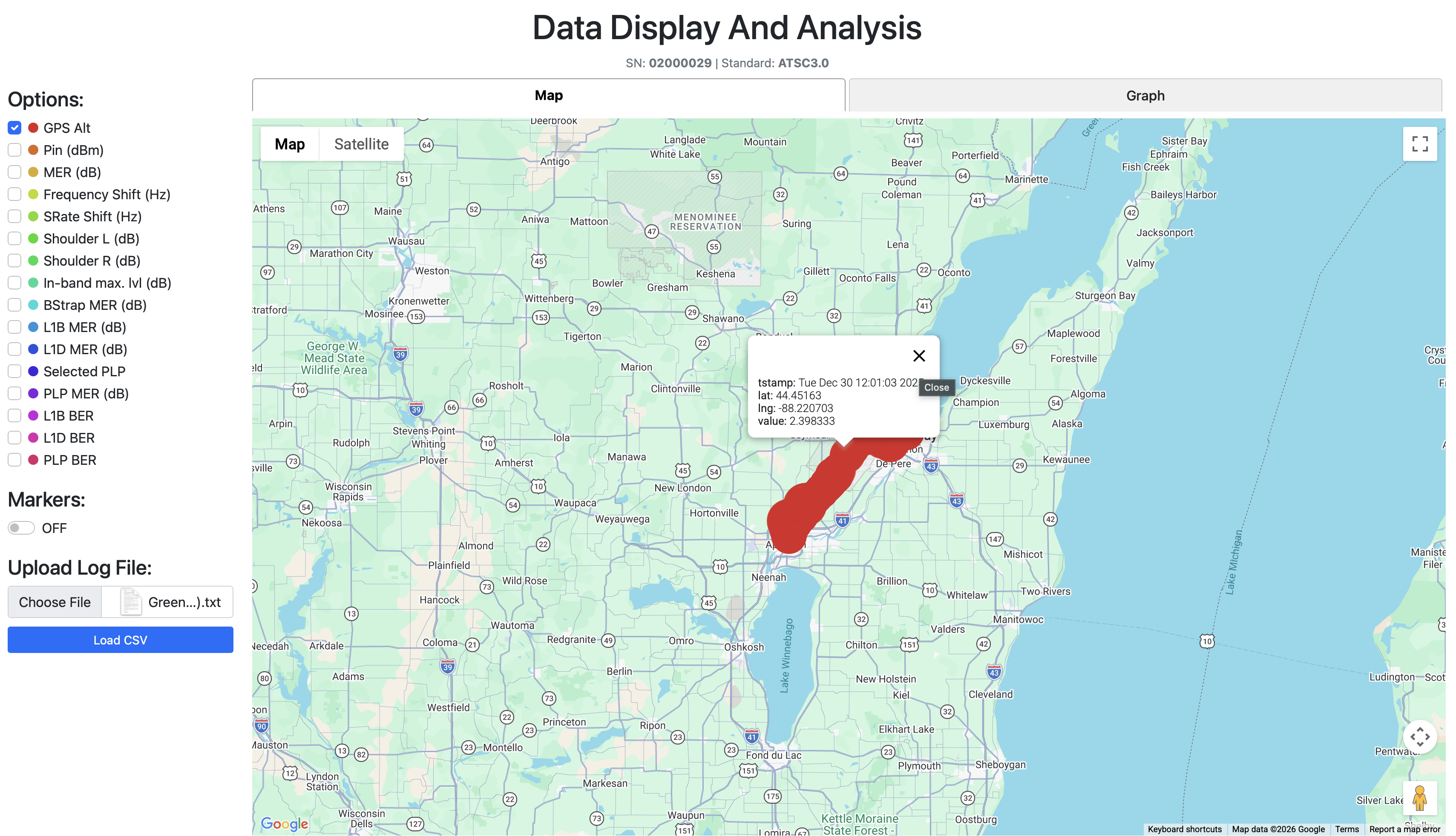 Users could now select specific metrics one at a time instead of seeing everything at once.
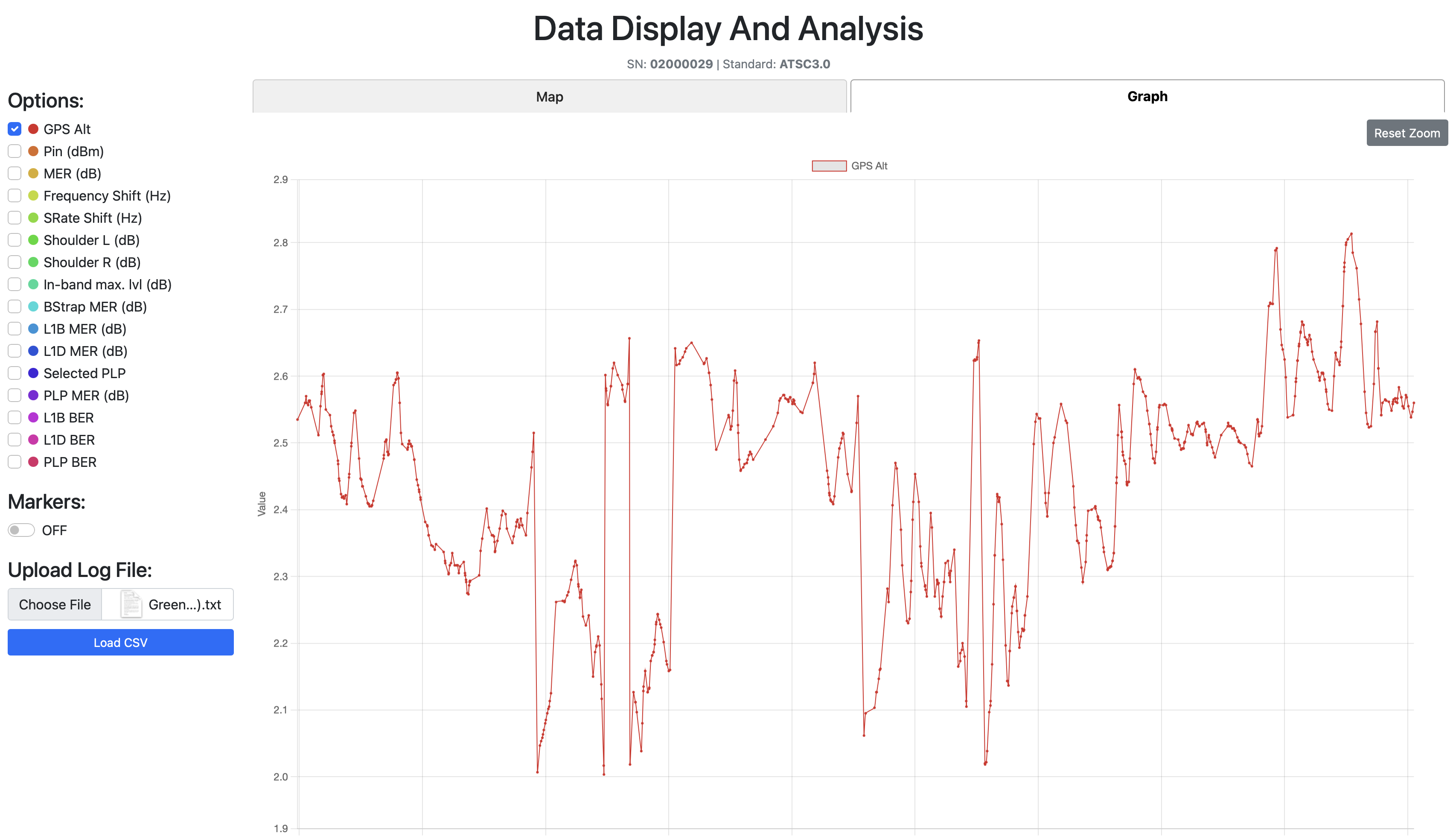 The Graph Tab: signal parameter changes over the drive test timeline.
Then I added a Graph Tab, a visualization showing how a chosen signal parameter changes over time during the drive test. Signal degradation patterns. Problem areas. Now visible.
But before I could make that graph useful, I needed to solve a data density problem.
The Downsampling Disaster (And How LTTB Saved It)
I was learning about spectrum plots and how they use min-max downsampling to show peaks. From far away a min-max downsampled plot looks like an average line, but zoom in and you see the actual extremes. Most analysis tools use this to work faster while keeping peak information.
So I added min-max downsampling to my graph.
And the plot looked worse. Way harder to read than showing all the raw data without any downsampling at all. Complete visual chaos.
Then one of my coworkers said something to me that stuck through every single data analysis build I've done since.
"Most of the time there is no need for average, as that means everything is okay. We need the peaks to better understand where the issues are and how close we are to the thresholds."
I sat there. Let that sink in.
That wasn't just advice about downsampling. That was a philosophy. Don't show people what's fine. Show them what's about to break.
So I started searching forums. And stumbled upon LTTB (Largest Triangle Three Buckets). The downsampling algorithm used by most broadcasting companies.
How LTTB Works
You have 3 buckets. A "previous" bucket, a "main" bucket, and a "next" bucket. Each bucket is a small group of consecutive data points (let's say 50 each - but this number is actually a variable that changes).
The algorithm:
- Grab the previously chosen point from the previous bucket
- Calculate the average point of the next bucket
- Draw an imaginary line between those two reference points
- Find the point in the main bucket that deviates the MOST from that line, the one that creates the largest triangle area
- That's your chosen point. Move to the next bucket. Repeat.
For edge cases: the first point in the dataset becomes the "previous" reference for the first bucket. The last point becomes the "next" reference for the last bucket.
Why this is better than min-max: LTTB preserves the shape of the data. It keeps the peaks AND the valleys AND the flow. Min-max just grabs extremes and creates a jagged mess.
Here's the actual implementation:
// LTTB Downsampling - Largest Triangle Three Buckets
// Preserves peaks and visual shape while reducing point count
function downsampleLTTB(points, bucketCount) {
    if (!points || points.length <= bucketCount) return points;

    const result = [];
    const bucketSize = (points.length - 2) / (bucketCount - 2);

    // Always include first point
    result.push({ ...points[0], _bucketIndices: [points[0].dataIndex] });

    let prevSelectedIdx = 0;

    for (let i = 0; i < bucketCount - 2; i++) {
        const bucketStart = Math.floor((i + 1) * bucketSize) + 1;
        const bucketEnd = Math.min(
            Math.floor((i + 2) * bucketSize) + 1,
            points.length - 1
        );

        // Step 1: Calculate average point of NEXT bucket
        const nextBucketStart = bucketEnd;
        const nextBucketEnd = Math.min(
            Math.floor((i + 3) * bucketSize) + 1,
            points.length
        );

        let avgX = 0, avgY = 0;
        for (let j = nextBucketStart; j < nextBucketEnd; j++) {
            avgX += points[j]._tstampMs;
            avgY += points[j].value;
        }
        const nextBucketSize = nextBucketEnd - nextBucketStart;
        if (nextBucketSize > 0) {
            avgX /= nextBucketSize;
            avgY /= nextBucketSize;
        }

        // Step 2: Find point in main bucket that creates largest triangle
        let maxArea = -1;
        let maxAreaIdx = bucketStart;
        const prevPoint = points[prevSelectedIdx];

        for (let j = bucketStart; j < bucketEnd; j++) {
            const point = points[j];
            // Triangle area between previous selected, current candidate,
            // and next bucket's average
            const area = Math.abs(
                (prevPoint._tstampMs - avgX) * (point.value - prevPoint.value) -
                (prevPoint._tstampMs - point._tstampMs) * (avgY - prevPoint.value)
            );
            if (area > maxArea) {
                maxArea = area;
                maxAreaIdx = j;
            }
        }

        result.push({ ...points[maxAreaIdx], _bucketIndices: bucketIndices });
        prevSelectedIdx = maxAreaIdx;
    }

    // Always include last point
    result.push({ ...points[points.length - 1] });
    return result;
}
The triangle area formula is the key part. For three points A(x₁,y₁), B(x₂,y₂), C(x₃,y₃):
Area = |( x₁(y₂ - y₃) + x₂(y₃ - y₁) + x₃(y₁ - y₂) )| / 2
The point that creates the largest triangle is the one that deviates the most from the straight line between the previous point and the next bucket's average. That's your most "significant" point, the one you'd lose the most visual information from if you removed it.

Left: Raw data with min-max downsampling, visual chaos. Right: LTTB downsampling, preserved peaks and clean shape.
Now I had clean, readable graphs that still held every spike and dip the engineers needed to see.
The Prediction Problem
At this point, we could only analyze where we'd already driven.
That's it.
No predictions for untested areas. Engineers wanted to know: "What about all the areas we didn't test?" Drive tests are slow, expensive, labor intensive. You can't just drive every road in America.
We needed theoretical coverage predictions. For that, we needed station data.
The FCC Goldmine
American stations are very easy to find. The FCC keeps records on everything. So I downloaded all broadcast station data from the FCC database:
- ERP (Effective Radiated Power) in kilowatts
- Transmitter latitude and longitude
- HAAT (Height Above Average Terrain) in meters
- Channel number
- Facility ID
Parsed it. Loaded it. Placed every FCC-registered station on the map. The code was straightforward:
// FCC Station data structure
let fccStations = [];
let selectedStation = null;
let stationMarker = null;
let stationCircle = null;

// Load FCC stations from parsed JSON
function loadFCCStations() {
    if (typeof FCC_STATION_DATA !== 'undefined' && FCC_STATION_DATA.length > 0) {
        fccStations = FCC_STATION_DATA;
        console.log(`Loaded ${fccStations.length} TV stations`);
        waitForStationElements();
    }
}
Now users could see both their drive test data AND the nearest station, anywhere in America.
But here's the thing: at this point, I only had a basic coverage circle. Not based on propagation physics at all. Just "bigger power = bigger circle":
// FIRST ATTEMPT - Coverage radius from ERP (logarithmic scale)
// Problem: This is NOT physics-based propagation!
function displayStationOnMap() {
    const minRadius = 5000;    // 5 km minimum
    const maxRadius = 100000;  // 100 km maximum
    const logMin = Math.log10(0.09);
    const logMax = Math.log10(1000);
    const logERP = Math.log10(Math.max(0.09, erpKW));
    const normalizedERP = (logERP - logMin) / (logMax - logMin);
    const radiusMeters = minRadius + normalizedERP * (maxRadius - minRadius);

    // Just one orange circle - NOT based on real propagation
    stationCircle = new google.maps.Circle({
        strokeColor: '#ff6b00',
        strokeOpacity: 0.8,
        fillColor: '#ff6b00',
        fillOpacity: 0.15,
        map: map,
        center: { lat, lng },
        radius: radiusMeters
    });
}
This told us nothing useful. Just a pretty circle. I needed real physics.
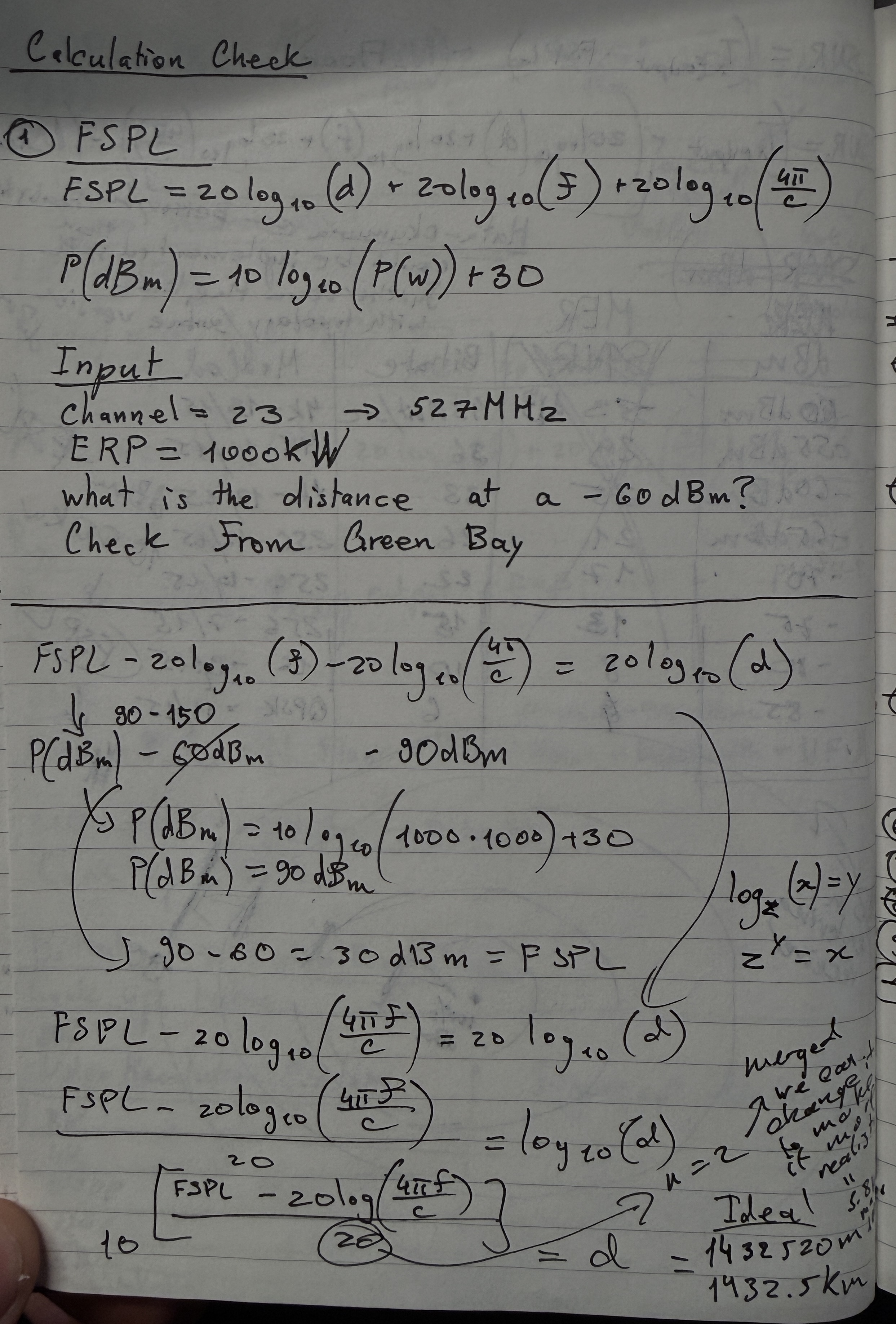
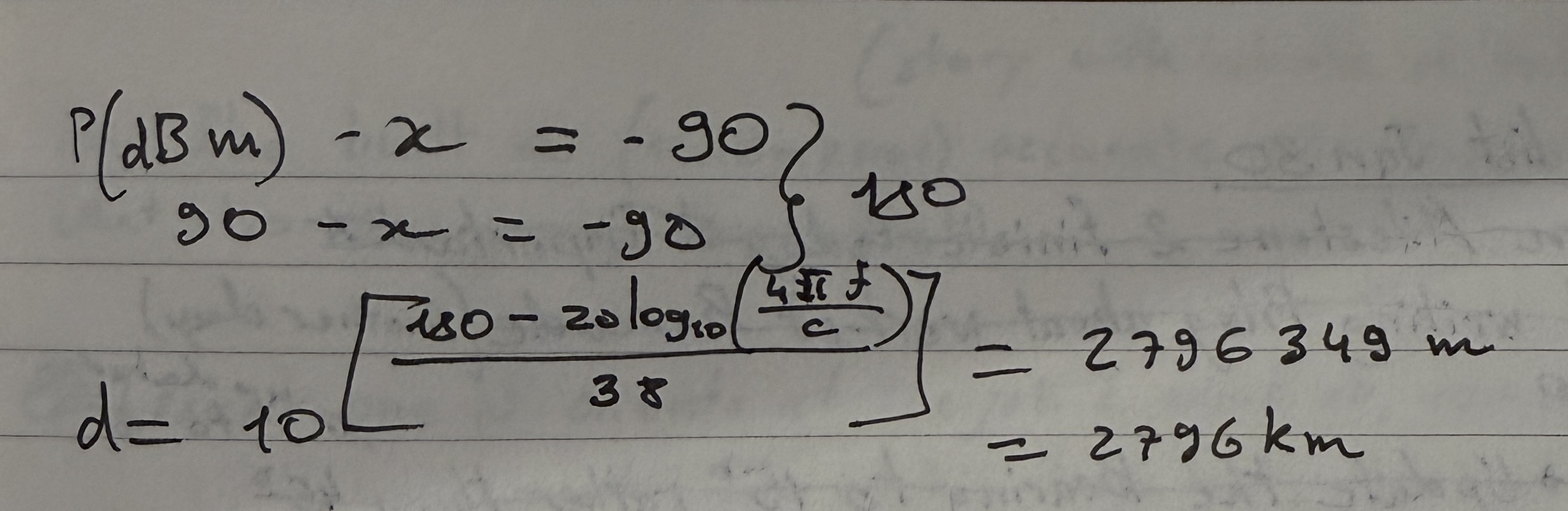
The Formula That Lied To Me (FSPL)
With channel number, HAAT, and ERP from the FCC data, I could now calculate theoretical signal strength drop-off with distance. I started with the textbook formula, Free Space Path Loss (FSPL).
The Math
FSPL describes how a signal weakens over distance in a perfect vacuum:
FSPL(dB) = 20 × log₁₀(d_km) + 20 × log₁₀(f_MHz) + 32.45
Where d_km is the distance and f_MHz is the frequency. The 32.45 constant comes from converting wavelength to the right units (it absorbs the speed of light and unit conversion factors).
But first I needed to convert channel numbers to frequencies. ATSC channels map like this:
// Channel to frequency mapping
// VHF Low:  channels 2-6  → 54-88 MHz
// VHF High: channels 7-13 → 174-216 MHz
// UHF:      channels 14-83 → 473 + 6*(ch-14) MHz

const CHANNEL_FREQUENCY_MAP = {
    // VHF Low (54-88 MHz)
    2: 57, 3: 63, 4: 69, 5: 79, 6: 85,
    // VHF High (174-216 MHz)
    7: 177, 8: 183, 9: 189, 10: 195, 11: 201, 12: 207, 13: 213
};

// UHF channels calculated by formula
for (let ch = 14; ch <= 83; ch++) {
    CHANNEL_FREQUENCY_MAP[ch] = 473 + 6 * (ch - 14);
}
Each UHF channel is 6 MHz wide. Channel 14 starts at 470 MHz, center frequency at 473 MHz. Every channel up just adds 6.
Then I needed distance between two GPS points. Earth isn't flat (sorry flat-earthers), so you can't just subtract coordinates. Haversine formula handles this:
// GPS distance using Haversine formula
// Accounts for Earth's curvature - gives great-circle distance
function haversineDistance(lat1, lon1, lat2, lon2) {
    const R = 6371; // Earth radius in km
    const dLat = (lat2 - lat1) * Math.PI / 180;
    const dLon = (lon2 - lon1) * Math.PI / 180;
    const a = Math.sin(dLat / 2) ** 2 +
              Math.cos(lat1 * Math.PI / 180) *
              Math.cos(lat2 * Math.PI / 180) *
              Math.sin(dLon / 2) ** 2;
    return R * 2 * Math.atan2(Math.sqrt(a), Math.sqrt(1 - a));
}
Quick explanation: the Haversine formula calculates the shortest path between two points on a sphere (great-circle distance). The a variable represents the square of half the chord length between the points, and atan2 converts it back to an angular distance, which gets multiplied by Earth's radius for kilometers.
Now FSPL itself:
// Free Space Path Loss
// Formula: FSPL(dB) = 20*log10(d_km) + 20*log10(f_MHz) + 32.45
function calculateFSPL(distanceKm, frequencyMHz) {
    if (distanceKm <= 0) distanceKm = 0.001; // Avoid log(0) → -Infinity
    return 20 * Math.log10(distanceKm) + 20 * Math.log10(frequencyMHz) + 32.45;
}
And the link budget (converting transmitter power minus path loss into received power):
// Link budget: Received Power = Transmitted Power - Path Loss
// ERP_dBm = 10 * log10(ERP_kW × 1,000,000)   ← convert kW to mW then to dBm
// P_rx = ERP_dBm - FSPL
function calculateTheoreticalDbm(erpKW, fsplDb) {
    const erpDbm = 10 * Math.log10(erpKW * 1000000);
    return erpDbm - fsplDb;
}
Why multiply by 1,000,000? dBm is referenced to milliwatts. 1 kW = 1,000,000 mW. So 10 × log₁₀(1,000,000) = 60 dBm. A 1kW station transmits at 60 dBm.
With all these pieces, I could now predict the theoretical signal at every measurement point:
// Calculate predicted signal at every drive test measurement point
function calculateTheoreticalSignal(station, data) {
    if (!station || !data || data.length === 0) return [];

    const frequencyMHz = CHANNEL_FREQUENCY_MAP[station.Channel];
    if (!frequencyMHz) {
        console.warn(`Unknown channel ${station.Channel}`);
        return [];
    }

    const results = [];

    for (let i = 0; i < data.length; i++) {
        const row = data[i];
        const pointLat = parseFloat(row["GPS Lat"]);
        const pointLon = parseFloat(row["GPS Long"]);

        if (isNaN(pointLat) || isNaN(pointLon)) continue;

        // 1. Distance from station to measurement point
        const distanceKm = haversineDistance(
            station.Latitude, station.Longitude,
            pointLat, pointLon
        );

        // 2. Path loss at that distance and frequency
        const fspl = calculateFSPL(distanceKm, frequencyMHz);

        // 3. Received power = transmitted power - path loss
        const theoreticalDbm = calculateTheoreticalDbm(station.ERP_kW, fspl);

        results.push({
            tstamp: row[timestampKey],
            _tstampMs: row._tstampMs,
            value: theoreticalDbm,
            dataIndex: i
        });
    }

    return results;
}
Now I had an orange dashed line on the graph showing predicted signal alongside the actual measured data.

Where FSPL Lied
I plotted the first coverage circles on the map.
They were WAY too big.
Testing in the lab showed signals typically drop to -60 dBm at around 100km for real stations. But FSPL predicted much farther ranges. The circle looked massive.
I wasn't experienced with in-field practical data so maybe it was right? But it didn't feel right. I started searching for guidelines: what power + height should give you what distance at -60dBm in practice.
Found NOTHING online.
Until one of the lab coworkers told me the missing piece: at ERP 1MW and height around 300 meters, the distance to -60dBm drop-off is around 100km in the real world.
So I went back to my calculations. And this is where things got educational.
The Path Loss Exponent Discovery
Those 20s in the FSPL formula? They're not magic constants. They're both n × 10, where n is the path loss exponent. In free space, n = 2 (that's why it's 20). But in the real world, n is higher because signals encounter obstacles.
FSPL(dB) = n×10 × log₁₀(d_km) + 20 × log₁₀(f_MHz) + 32.45
           ↑
           path loss exponent × 10
           n=2 for free space
           n=3-4 for real environments
I found the nearest city at approximately 100km from a known station and calibrated. Landed on n = 3.8 for the distance component:
// IMPROVED: Physics-based coverage radius with calibrated path loss exponent
const RECEIVER_SENSITIVITY_DBM = -60;  // Signal usability threshold

function calculateCoverageRadius(erpKW, channel, haatMeters) {
    const frequencyMHz = CHANNEL_FREQUENCY_MAP[channel];
    if (!frequencyMHz) return null;

    // At threshold: -60 = ERP_dBm - PathLoss
    // So max allowable PathLoss = ERP_dBm + 60
    const erpDbm = 10 * Math.log10(erpKW * 1000000);
    const maxFspl = erpDbm - RECEIVER_SENSITIVITY_DBM;

    // Solve for distance with n=3.8 (path loss exponent = 38)
    // PathLoss = 38*log10(d) + 20*log10(f) + 32.45
    // d = 10^((PathLoss - 20*log10(f) - 32.45) / 38)
    const pathLossDistanceKm = Math.pow(10,
        (maxFspl - 20 * Math.log10(frequencyMHz) - 32.45) / 38
    );

    // Cap at radio horizon (Earth curvature limit)
    const horizonDistanceKm = calculateRadioHorizon(haatMeters);

    return Math.min(pathLossDistanceKm, horizonDistanceKm) * 1000; // → meters
}
Radio Horizon
I also added the radio horizon calculation, because signals can't bend around the Earth forever:
// Earth curvature limit for line-of-sight signals
// Formula: Horizon(km) = 4.12 × (√h_tx + √h_rx)
// Uses 4/3 Earth radius model (accounts for atmospheric refraction)
function calculateRadioHorizon(txHeightM, rxHeightM = 10) {
    return 4.12 * (Math.sqrt(txHeightM) + Math.sqrt(rxHeightM));
}
The 4.12 constant comes from √(2 × 4/3 × R_earth) converted to km. The 4/3 Earth radius model accounts for the fact that radio waves refract slightly in the atmosphere, bending along the curvature. This gives you about 15% more range than pure geometric line-of-sight.
And if you try to tell me the earth is flat... well, then theoretically the signals would just fly forever and none of these calculations matter.
Gradient Coverage Circles
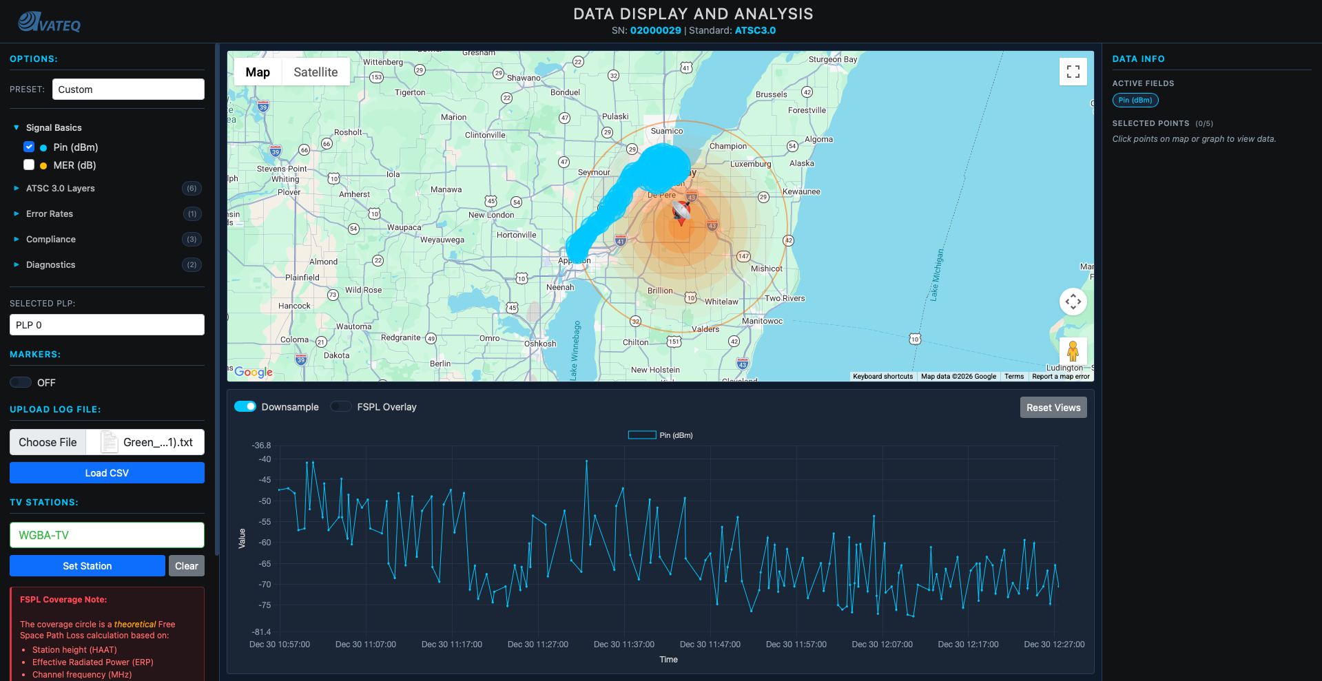
Instead of one flat circle, I added gradient rings showing signal strength decay:
// Multiple rings showing signal strength gradient
function generateGradientCircles(station, numRings = 8) {
    const maxRadius = calculateCoverageRadius(
        station.ERP_kW, station.Channel, station.HAAT_m
    );
    if (!maxRadius || maxRadius <= 0) return [];

    // Topological color palette (colorbrewer2.org) - strong to weak
    const palette = [
        '#ffffd9','#edf8b1','#c7e9b4','#7fcdbb',
        '#41b6c4','#1d91c0','#225ea8','#0c2c84'
    ];

    const circles = [];
    for (let i = 0; i < numRings; i++) {
        const fraction = (i + 1) / numRings;
        const radius = maxRadius * fraction;
        const colorIndex = numRings - 1 - i; // Outer = weaker = darker

        circles.push({
            radius: radius,
            color: palette[colorIndex],
            fillOpacity: 0.35,
            strokeOpacity: 0
        });
    }
    return circles;
}
Thanks to a coworker trained in cartography/topology, those colors came from colorbrewer2.org, a tool that generates palettes designed for cartographic accuracy. If you have 3 rings or 9 rings, the colors are always visually appropriate.
But the bigger issue remained. Logarithmic distance growth meant that even a jump of -3 dBm covers a MUCH bigger area than you'd expect. I went home and hand-calculated everything, which confirmed: FSPL assumes perfect vacuum. No buildings. No terrain. No atmosphere.
Accuracy at this point:
FSPL only     → ~30 dB error in many cases
FSPL + horizon → ~20 dB error
I needed a real propagation model.
Bitrate Coverage Zones (The Big Fail)
Before finding that better model, I made the classic mistake.
I tried to add more features on top of a broken foundation.
The idea: show not just signal strength, but where different video resolutions would actually work. This was more for end users. Anyone could see "at this distance I can't watch 4K, my bitrate drops, resolution drops." Currently with FSPL we were only showing where L1 emergency content (text-only, no video, no audio) could be received.
Because not everyone is looking for only emergency text. Some people want to watch their favourite sports team at high quality. There's a reason people buy high end televisions.
ATSC 3.0 ModCod (Modulation + Coding)
Signal quality determines maximum supportable modulation, which determines achievable bitrate:
| Modulation | Code Rate | Required MER (dB) | Bitrate (Mbps) | Video Quality |
|---|---|---|---|---|
| 4096-QAM | 13/15 | 32.8 | ~43 | 8K UHD |
| 1024-QAM | 13/15 | 27.6 | ~40 | 4K UHD |
| 256-QAM | 13/15 | 22.2 | ~30 | 4K UHD |
| 64-QAM | 13/15 | 17.0 | ~22 | 1080p HD |
| 16-QAM | 13/15 | 11.8 | ~15 | 1080p HD |
| QPSK | 13/15 | 5.5 | ~7 | 720p HD |
| QPSK | 6/15 | -0.5 | ~4 | 480p SD |
Higher modulation = more bits per symbol = higher bitrate, but you need a cleaner signal (higher MER) to decode it.
Thermal Noise Floor
Before calculating SNR, you need the noise floor. Thermal noise floor is the sound of molecules at room temperature (20-25°C). It determines the absolute baseline, the lowest level the receiver can possibly decode.
N_floor = -174 + 10 × log₁₀(BW) + NF
Where:
- -174 dBm/Hz, comes from the Boltzmann constant × room temperature (k × T). This is fundamental physics: at 290K, every Hz of bandwidth carries -174 dBm of thermal noise
- BW = 6 MHz, ATSC channel bandwidth:
10 × log₁₀(6,000,000) = 67.8 dB - NF = 7 dB, typical receiver noise figure (the noise the receiver itself adds)
N_floor = -174 + 67.8 + 7 = -99 dBm
Then SNR:
SNR(dB) = P_rx(dBm) - N_floor(dBm)
The calculation chain:
ERP → FSPL → P_rx → SNR → ModCod lookup → Bitrate → Video Quality
Coverage zones would look like this:
Station [*]
  └─ 8K UHD (purple)  ~20-30 km
    └─ 4K UHD (green)  ~40-60 km
      └─ 1080p HD (blue)  ~60-90 km
        └─ 720p HD (orange)  ~90-120 km
          └─ 480p SD (red)  ~120-150 km
            └─ No Service (gray) beyond
Why It Failed
The problem? FSPL was already wrong. And I was stacking more chaos on top of chaos.
I tried to build the full calculation chain from scratch. Wrote all the calculations. Started implementing everything without testing.
Which is always the worst idea.
The predicted bitrate zones were so wrong that the areas made zero sense. I was so fed up that I started hand-calculating everything on paper.
Same conclusion: a 3 dB error in FSPL propagates through every step. Wrong signal strength → wrong SNR → wrong ModCod selection → wrong bitrate → wrong video quality zone. Each layer amplifies the error from the previous one.
I needed to fix the foundation first.
Hata-Okumura: The Slower, Smarter Approach
My hand calculations confirmed: FSPL is a "perfect world" formula. Flat earth. Vacuum. No obstacles. Real signals need terrain-aware models.
Hata-Okumura is a propagation model based on empirical measurements in actual cities. Not theoretical vacuum. Real data from real places.
The Formulas
Urban path loss (base model):
L_urban(dB) = 69.55 + 26.16 × log₁₀(f) - 13.82 × log₁₀(h_b) - a(h_m)
              + [44.9 - 6.55 × log₁₀(h_b)] × log₁₀(d)
Where:
f= frequency in MHz (470-698 for UHF)h_b= base station antenna height in meters (HAAT from FCC data)h_m= receiver height (1.5-10m)d= distance in kma(h_m)= receiver height correction factor
Suburban correction: L_sub = L_urban - 2 × [log₁₀(f/28)]² - 5.4
Rural correction: L_rural = L_urban - 4.78 × (log₁₀f)² + 18.33 × log₁₀(f) - 40.94
Valid ranges: 1-20 km distance (extended to 100 km with correction), 150-1500 MHz frequency, 30-200m transmitter height.
Here's the full implementation:
// Hata-Okumura model constants and valid ranges
const HATA_CONSTANTS = {
    MIN_FREQUENCY: 150,
    MAX_FREQUENCY: 1500,
    MIN_DISTANCE: 1,
    MAX_DISTANCE_STANDARD: 20,
    MAX_DISTANCE_EXTENDED: 100,
    MIN_TX_HEIGHT: 30,
    MAX_TX_HEIGHT: 200
};

// Receiver height correction factor a(h_m)
// Different formulas for large vs small/medium cities
function getReceiverCorrection(frequencyMHz, rxHeightM, cityType) {
    const f = frequencyMHz;
    const hRx = Math.max(1, rxHeightM);

    if (cityType === 'large') {
        // Large city correction (empirical from Tokyo/Osaka measurements)
        if (f <= 300) {
            return 8.29 * Math.pow(Math.log10(1.54 * hRx), 2) - 1.1;
        } else {
            return 3.2 * Math.pow(Math.log10(11.75 * hRx), 2) - 4.97;
        }
    }

    // Small/medium city correction
    return (1.1 * Math.log10(f) - 0.7) * hRx - (1.56 * Math.log10(f) - 0.8);
}

// Urban Hata path loss (base model)
function calculateUrbanLoss(distanceKm, frequencyMHz, txHeightM, rxHeightM, cityType) {
    const d = Math.max(0.001, distanceKm);
    const f = frequencyMHz;
    const hTx = txHeightM;
    const aHrx = getReceiverCorrection(f, rxHeightM, cityType);

    return 69.55 +
           26.16 * Math.log10(f) -
           13.82 * Math.log10(hTx) -
           aHrx +
           (44.9 - 6.55 * Math.log10(hTx)) * Math.log10(d);
}

// Suburban correction
// Reduces loss - fewer buildings, less clutter
function calculateSuburbanLoss(distanceKm, frequencyMHz, txHeightM, rxHeightM) {
    const urbanLoss = calculateUrbanLoss(
        distanceKm, frequencyMHz, txHeightM, rxHeightM, 'medium'
    );
    const correction = 2 * Math.pow(Math.log10(frequencyMHz / 28), 2) + 5.4;
    return urbanLoss - correction;  // ← SUBTRACT correction (less loss)
}

// Rural/open area correction
// Even less loss - minimal obstacles
function calculateRuralLoss(distanceKm, frequencyMHz, txHeightM, rxHeightM) {
    const urbanLoss = calculateUrbanLoss(
        distanceKm, frequencyMHz, txHeightM, rxHeightM, 'medium'
    );
    const correction = 4.78 * Math.pow(Math.log10(frequencyMHz), 2) -
                       18.33 * Math.log10(frequencyMHz) + 40.94;
    return urbanLoss - correction;
}
Key insight about the corrections: both suburban and rural corrections are subtracted from the urban loss. Why? Because urban environments have the MOST obstacles. Open rural areas have the least signal loss, so you subtract the most. Suburban is in between. The corrections are always positive values being subtracted.
Now I had model selection, the user could toggle between FSPL (theoretical) and Hata (realistic):
// Model selection toggle
let propagationModel = 'fspl';  // or 'hata'

function calculateTheoreticalSignal(station, data) {
    const useHata = propagationModel === 'hata'
                    && typeof calculateHataLoss === 'function';

    for (let i = 0; i < data.length; i++) {
        // ... get lat/lon/distance ...

        let pathLoss;
        if (useHata) {
            // Terrain-aware Hata model
            const terrain = getTerrainAtPointSync(pointLat, pointLon);
            pathLoss = calculateHataLoss(
                distanceKm, frequencyMHz, txHeightM, rxHeightM,
                terrain.env, terrain.type
            );
        } else {
            // Simple FSPL
            pathLoss = calculateFSPL(distanceKm, frequencyMHz);
        }

        theoreticalDbm = calculateTheoreticalDbm(effectiveErpKW, pathLoss);
    }
}
But there was a problem. Hata-Okumura needs to know what kind of terrain the signal is passing through, and I didn't have terrain data yet. All areas were being treated the same.
Plus all stations were still omni-directional, broadcasting equally in every direction. Most real stations don't do that.
The Second Goldmine: Directional Antennas
The FCC surprised me again.
I discovered they publish the full directional antenna pattern data for every station. Not just total ERP, but how much power goes in each direction. Bearing-specific power weights.
Analogy: Think flashlight vs light bulb.
- Omni-directional = light bulb (spreads evenly everywhere)
- Directional = flashlight (focuses power in specific directions)
The only issue: FCC data wasn't organized in a downloadable format. Most documentation was on the website itself. So I scraped it. Simple enough since it was basic HTML.
Structured everything into JSON:
{
    "CALL": "KREX-TV",
    "Service": "DTV",
    "Channel": 2,
    "City": "GRAND JUNCTION",
    "State": "CO",
    "ERP_kW": 0.8,
    "FacilityID": 70596,
    "Latitude": 39.088056,
    "Longitude": -108.566667,
    "HAAT_m": -36,
    "technical": {
      "agl_m": 83.8,
      "amsl_m": 1498.1,
      "polarization": "H",
      "antennaModel": "THA-04-1L-4L-1N CH2",
      "status": "LIC"
    },
    "antennaPattern": {
      "rotate": 0,
      "values": {
        "0": 0.938, "10": 0.839, "20": 0.734,
        "30": 0.838, "40": 0.994, "42": 1.0,
        "50": 0.928, "60": 0.744, "70": 0.751,
        "...": "...",
        "350": 0.883, "360": 0.938
      }
    }
}
The antennaPattern.values are relative field strength values from 0 to 1.0 at different bearings (degrees). A value of 1.0 = maximum power in that direction. A value of 0.734 = only 73.4% of the field strength goes that way.
Critical detail: Power = Field². So if relative field is 0.734, the actual relative power is 0.734² = 0.539. The station is putting only 54% of its ERP in that direction.
Here's the bearing calculation and antenna pattern interpolation:
// Calculate compass bearing from station to any point
function calculateBearing(lat1, lon1, lat2, lon2) {
    const lat1Rad = lat1 * Math.PI / 180;
    const lat2Rad = lat2 * Math.PI / 180;
    const dLonRad = (lon2 - lon1) * Math.PI / 180;

    const y = Math.sin(dLonRad) * Math.cos(lat2Rad);
    const x = Math.cos(lat1Rad) * Math.sin(lat2Rad) -
              Math.sin(lat1Rad) * Math.cos(lat2Rad) * Math.cos(dLonRad);

    let bearing = Math.atan2(y, x) * 180 / Math.PI;
    return (bearing + 360) % 360;  // Normalize to 0-360°
}

// Interpolate antenna pattern for any bearing angle
// FCC data only gives values at specific bearings (0°, 10°, 20°, etc.)
// We need to interpolate for bearings in between
function getRelativeField(facilityId, bearing) {
    if (typeof ANTENNA_PATTERNS === 'undefined') return 1.0;

    const pattern = ANTENNA_PATTERNS[facilityId];
    if (!pattern || !pattern.values) return 1.0;  // Default to omni

    // Apply rotation offset (some antennas are rotated from true north)
    let adjustedBearing = (bearing - (pattern.rotate || 0) + 360) % 360;

    // Get sorted bearing keys for interpolation
    const values = pattern.values;
    const bearings = Object.keys(values).map(Number).sort((a, b) => a - b);

    // Find the two surrounding bearings and linearly interpolate
    let lowerBearing, upperBearing;
    for (let i = 0; i < bearings.length - 1; i++) {
        if (bearings[i] <= adjustedBearing && bearings[i + 1] > adjustedBearing) {
            lowerBearing = bearings[i];
            upperBearing = bearings[i + 1];
            break;
        }
    }

    const lowerValue = values[lowerBearing];
    const upperValue = values[upperBearing];
    const fraction = (adjustedBearing - lowerBearing) / (upperBearing - lowerBearing);

    return lowerValue + (upperValue - lowerValue) * fraction;
}

// Apply directional pattern to get effective ERP for a specific bearing
// Power = Field², so effectiveERP = ERP × relativeField²
function applyDirectionalPattern(station, bearing) {
    if (!hasDirectionalPattern(station.FacilityID)) {
        return station.ERP_kW;  // Omni: full power all directions
    }

    const relativeField = getRelativeField(station.FacilityID, bearing);
    return station.ERP_kW * (relativeField * relativeField);  // Field² = Power
}
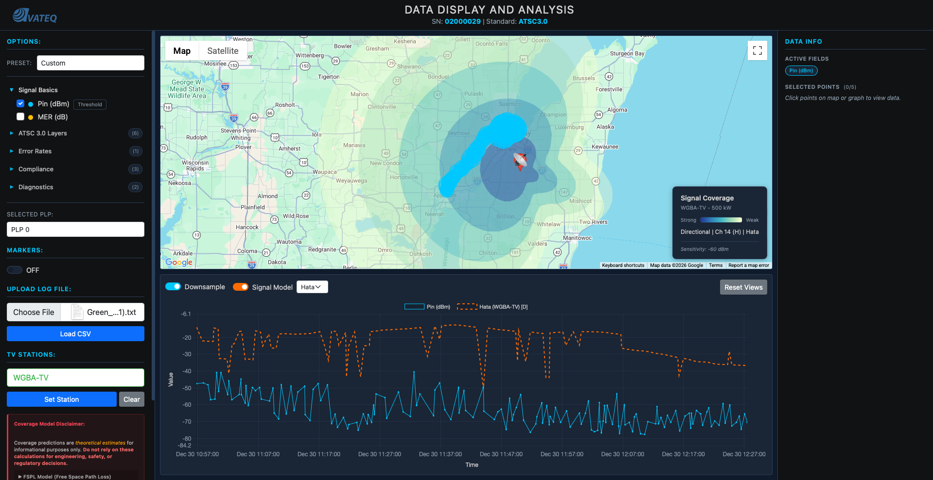
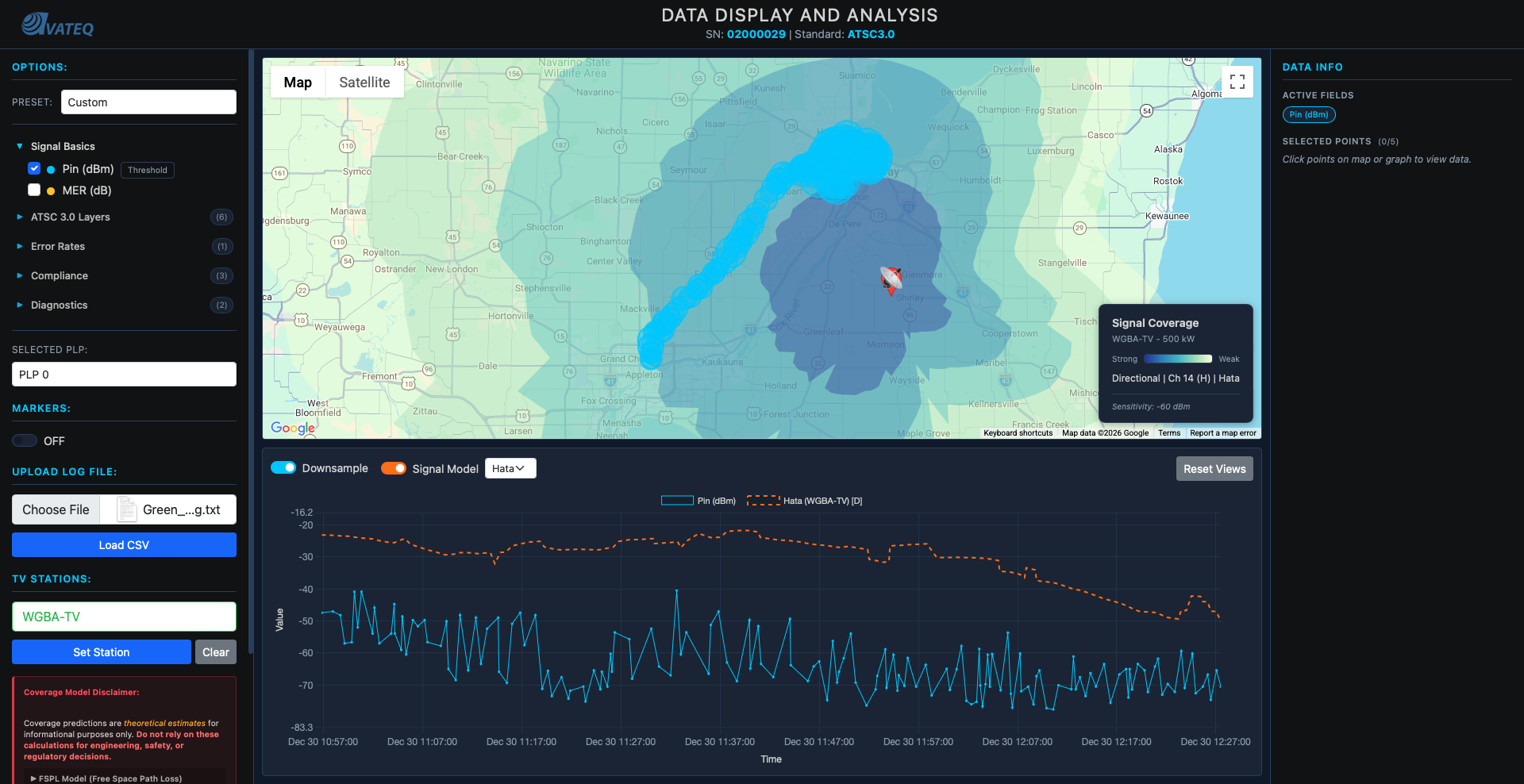
To draw directional coverage: calculate coverage radius for every 5-degree bearing, draw a radius line at each, then interconnect them and remove the inner lines. The result is a lobe shape matching what you see on FCC documentation pages, but now for actual predicted coverage areas.
Coverage shapes became realistic lobes instead of perfect circles.
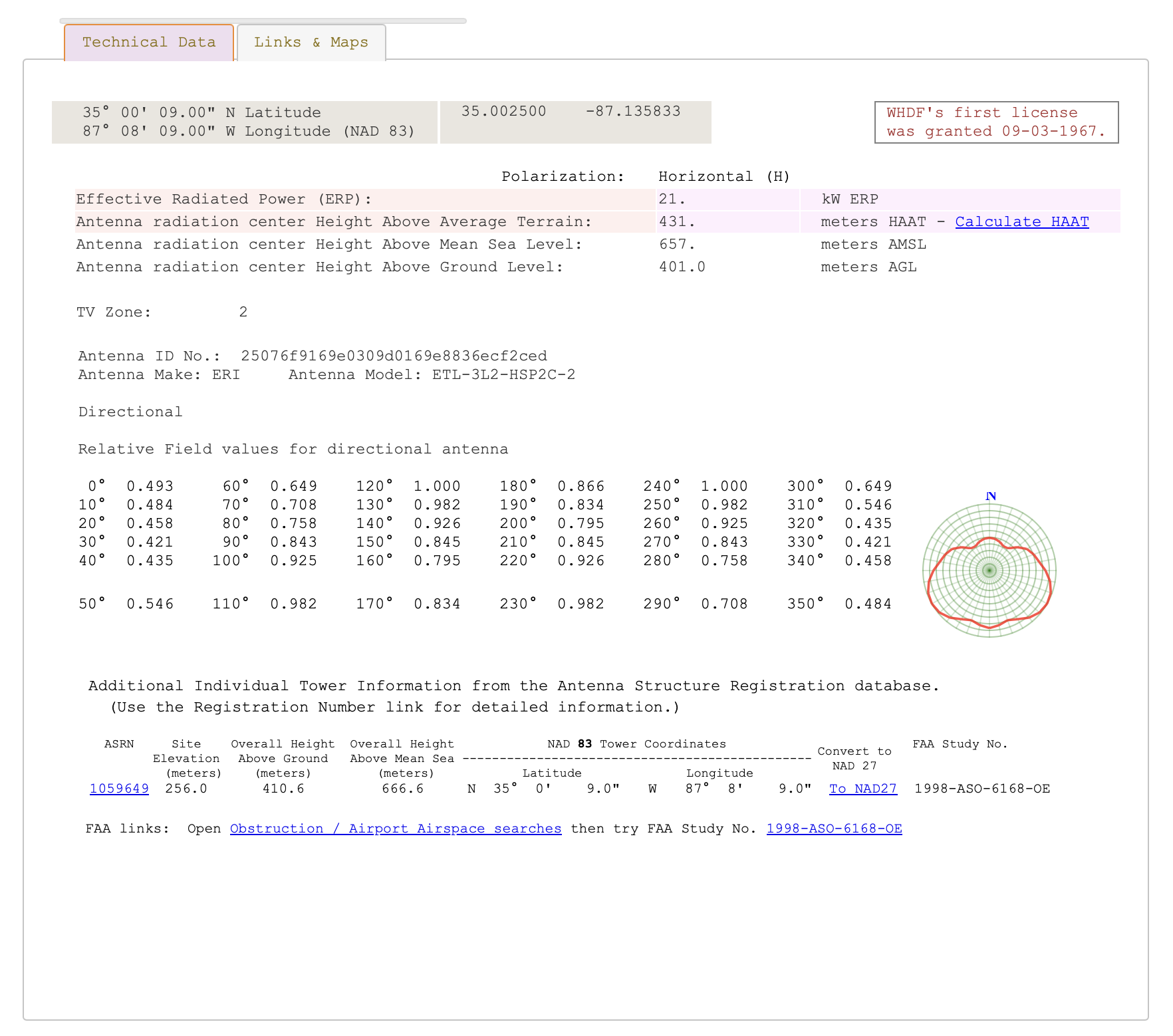 FCC official directional antenna pattern data showing relative field values for each bearing.
Everything Clicks: NLCD Terrain Data
Since we were already calculating bearing for directional antennas, we could ALSO determine terrain type along each bearing. And that meant choosing the right Hata-Okumura variant for each path segment.
NLCD Classification
NLCD (National Land Cover Database), resolution tiles showing land use types across the entire US. 1.44GB dataset. Different color codes for different terrain.
I mapped the NLCD codes to Hata-Okumura environment categories:
// NLCD land cover codes → Hata-Okumura environment classification
const NLCD_CLASSIFICATION = {
    // Developed Areas → Urban/Suburban
    21: { env: 'suburban', type: 'low',    name: 'Developed, Open' },
    22: { env: 'suburban', type: 'low',    name: 'Developed, Low Intensity' },
    23: { env: 'urban',    type: 'medium', name: 'Developed, Medium Intensity' },
    24: { env: 'urban',    type: 'large',  name: 'Developed, High Intensity' },

    // Forests → Rural + extra foliage attenuation
    41: { env: 'rural', type: 'forest', name: 'Deciduous Forest' },
    42: { env: 'rural', type: 'forest', name: 'Evergreen Forest' },
    43: { env: 'rural', type: 'forest', name: 'Mixed Forest' },

    // Open Areas → Rural (least signal loss)
    71: { env: 'rural', type: 'open', name: 'Grassland/Herbaceous' },
    82: { env: 'rural', type: 'open', name: 'Cultivated Crops' }
};
For each bearing, I sampled terrain at increasing distances:
// Sample terrain along a bearing from station
async function defineTerrainSegments(stationLat, stationLon, bearing, maxDistance) {
    const segments = [];

    for (const sample of TERRAIN_SAMPLE_CONFIG) {
        if (sample.distance > maxDistance) break;

        // Get GPS point at this distance along the bearing
        const point = getPointAtDistance(stationLat, stationLon, bearing, sample.distance);
        // Query NLCD tile at that point
        const nlcdCode = queryNLCDSync(point.lat, point.lon);
        // Classify into Hata environment
        const classification = classifyNLCD(nlcdCode);

        segments.push({
            startDist: segStart,
            endDist: sample.segmentEnd,
            environment: classification.env,
            terrainType: classification.type
        });
    }

    return segments;
}
The Weight-Averaging Mistake
My first approach to combining terrain segments was weight-averaging the Hata loss:
// WRONG: Weight-averaging flattens terrain variation!
function calculateWeightedPathLoss_OLD(distanceKm, freqMHz, txH, rxH, segments) {
    let totalLoss = 0;
    let totalWeight = 0;

    for (const segment of segments) {
        const segmentLength = overlapEnd - overlapStart;
        const weight = segmentLength / distanceKm;

        // Problem: Using FULL distance for ALL segments, then averaging
        const effectiveDistance = distanceKm;  // ← Same for urban AND rural!

        const segmentLoss = calculateHataLoss(
            effectiveDistance,  // Same for all segments!
            freqMHz, txH, rxH,
            segment.environment, segment.terrainType
        );

        totalLoss += segmentLoss * weight;
        totalWeight += weight;
    }

    return totalLoss / totalWeight;  // ← Averaging buries the variation
}
Why it was wrong: Urban Hata at 20km ≈ 145 dB. Rural Hata at 20km ≈ 130 dB. Difference = 15 dB. But for a path that's 70% rural and 30% urban: 130 × 0.7 + 145 × 0.3 = 134.5 dB. Only 4.5 dB above pure rural. The variation gets buried. The graph line was nearly flat.
The Fix: Additive Terrain Attenuation
Instead of averaging, I calculate a base Hata loss using the dominant terrain, then ADD extra dB per kilometer through difficult terrain:
// Terrain attenuation coefficients (additional dB per km)
const TERRAIN_ATTENUATION_DB_PER_KM = {
    urban_large:    0.8,  // Dense urban - highest additional loss
    urban_medium:   0.5,  // Medium urban
    suburban_low:   0.2,  // Light suburban
    suburban_medium: 0.3, // Medium suburban
    rural_forest:   0.4,  // Forest - significant foliage loss
    rural_open:     0.0   // Open rural - baseline (no extra loss)
};

function getTerrainAttenuationKey(environment, terrainType) {
    if (environment === 'urban') {
        return terrainType === 'large' ? 'urban_large' : 'urban_medium';
    } else if (environment === 'suburban') {
        return terrainType === 'low' ? 'suburban_low' : 'suburban_medium';
    } else if (environment === 'rural') {
        return terrainType === 'forest' ? 'rural_forest' : 'rural_open';
    }
    return 'suburban_medium';  // default fallback
}

// CORRECT: Additive attenuation creates visible terrain spikes
function calculateWeightedPathLoss(distanceKm, freqMHz, txH, rxH, segments) {
    if (!segments || segments.length === 0) {
        return calculateHataLoss(distanceKm, freqMHz, txH, rxH, 'suburban', 'medium');
    }

    // Step 1: Get dominant terrain type along the path
    const dominant = getDominantTerrain(segments, distanceKm);

    // Step 2: Calculate BASE loss using dominant terrain
    const baseLoss = calculateHataLoss(
        distanceKm, freqMHz, txH, rxH,
        dominant.environment, dominant.terrainType
    );

    // Step 3: ADD extra loss for each km through difficult terrain
    let additionalLoss = 0;

    for (const segment of segments) {
        const overlapStart = Math.max(segment.startDist, 0);
        const overlapEnd = Math.min(segment.endDist, distanceKm);
        if (overlapEnd <= overlapStart) continue;

        const segmentLengthKm = overlapEnd - overlapStart;
        const attenuationKey = getTerrainAttenuationKey(
            segment.environment, segment.terrainType
        );
        const dbPerKm = TERRAIN_ATTENUATION_DB_PER_KM[attenuationKey] || 0;

        // ADDITIVE: Each km through urban adds 0.5-0.8 dB on top
        additionalLoss += segmentLengthKm * dbPerKm;
    }

    return baseLoss + additionalLoss;
}
Why this works:
- 20 km through dense urban:
baseLoss + 20 × 0.8 = baseLoss + 16 dBextra - 20 km through forest:
baseLoss + 20 × 0.4 = baseLoss + 8 dBextra - 20 km through open rural:
baseLoss + 20 × 0 = baseLoss(no extra)
Now terrain changes created visible spikes in the graph. When the signal path crossed an urban area, you could see the dip. Cross a forest? Another dip. Open farmland? Signal holds steady.
| Before (weight-averaging) | After (additive attenuation) |
|---|---|
| Hata line nearly flat (~1-3 dB variation) | Visible terrain spikes (~10-16 dB) |
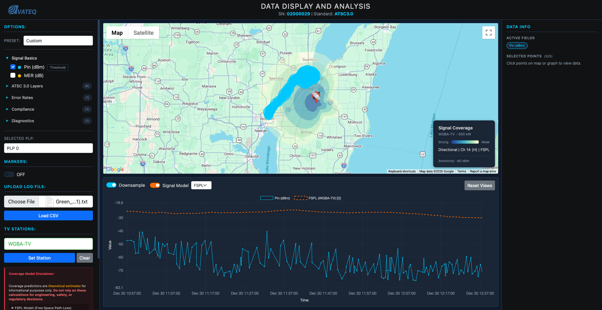
Left: FSPL-based prediction, smoother, less terrain variation. Right: Hata with additive terrain attenuation, visible spikes where the signal crosses urban areas and forests.
The Complete Signal Calculator
All the pieces came together into one function:
// Complete terrain-aware signal calculation
// This is the function that replaced the simple FSPL calculation
async function calculateRealisticSignal(station, receiverLat, receiverLon, options = {}) {
    const txHeight = getEffectiveAntennaHeight(station);
    const frequencyMHz = CHANNEL_FREQUENCY_MAP[station.Channel];

    // 1. Distance and bearing from station to receiver
    const distanceKm = haversineDistance(
        station.Latitude, station.Longitude,
        receiverLat, receiverLon
    );
    const bearing = calculateBearing(
        station.Latitude, station.Longitude,
        receiverLat, receiverLon
    );

    // 2. Apply directional antenna pattern (field² = power)
    let effectiveErpKW = station.ERP_kW;
    if (hasDirectionalPattern(station.FacilityID)) {
        const relativeField = getRelativeField(station.FacilityID, bearing);
        effectiveErpKW = station.ERP_kW * (relativeField * relativeField);
    }

    // 3. Get terrain segments along the signal path
    const segments = await defineTerrainSegments(
        station.Latitude, station.Longitude,
        bearing, distanceKm
    );

    // 4. Calculate terrain-aware path loss
    const pathLoss = calculateWeightedPathLoss(
        distanceKm, frequencyMHz, txHeight, rxHeight, segments
    );

    // 5. Link budget: received power = transmitted power - path loss
    const erpDbm = 10 * Math.log10(effectiveErpKW * 1000000);
    let receivedPowerDbm = erpDbm - pathLoss;

    // 6. Check radio horizon (Earth curvature limit)
    const horizonKm = calculateRadioHorizon(txHeight, rxHeight);
    if (distanceKm > horizonKm) {
        receivedPowerDbm = -Infinity;  // Beyond line of sight
    }

    return {
        receivedPower_dBm: receivedPowerDbm,
        distance_km: distanceKm,
        pathLoss_dB: pathLoss,
        dominantTerrain: getDominantTerrain(segments, distanceKm),
        beyondHorizon: distanceKm > horizonKm
    };
}
Accuracy improvement:
Start:         No predictions                → N/A
FSPL only:     Free space formula            → ~30 dB error
FSPL + horizon: Earth curvature limit        → ~20 dB error
Full system:   Hata + terrain + directional  → ~5-10 dB error (within measurement noise)
Understanding What Engineers Actually Need
Only NOW (after the core math was solid) did I go back and organize the metrics into tiers. Through all the research I'd been doing (AVS Forum, broadcast engineering communities, ATSC 3.0 documentation), I finally understood the hierarchy:
Tier 1: Essential Metrics:
- Pin (dBm): signal level, fundamental for coverage mapping
- MER (dB): THE quality indicator, tells you if signal is decodable
- PLP MER (dB): ATSC 3.0 specific, critical for troubleshooting individual streams
Tier 2: Troubleshooting Metrics:
- L1B MER: if L1-Basic fails, nothing works. This is the bootstrap signaling.
- L1D MER: can cause A/V loss even when PLP MER looks fine
- Frequency Shift: indicates oscillator/tuning problems
- Shoulder L/R: FCC compliance checking for spectrum mask
Key insight about ATSC 3.0: The triple-MER requirement (L1B, L1D, PLP) is the biggest change from ATSC 1.0. In the old standard you had one MER. Now you have three layers, and PLP MER can look perfectly fine while L1B or L1D are failing, which means total signal loss that PLP MER alone would never show you.
This research shaped the option parser I'd built earlier. I reorganized it from "just pick a metric" into tiered categories with fast presets. One click and the right combination of metrics loads immediately.
Screenshot coming soon: tiered metric organization with preset buttons.
The Speed Problem: Backend + Caching
This phase wasn't mathematical. Pure system design, caching, and architecture.
And it happened because I had to showcase this program to a pretty big engineer from a big company. I needed it fast.
The NLCD File Problem
Locally, the 1.44GB NLCD file loaded in 30 seconds. After reducing tile resolution (big impact on speed, minimal impact on calculation accuracy), it dropped to 60MB and loaded in 3 seconds. Map rendered, predictions showed, no problem.
Then I pushed to the web hosting server.
Eight minutes to load.
EIGHT. MINUTES.
I had NEVER worked with web hosting servers. I'd built multi-server local architectures, knew how to save files and make things work fast locally. But never on a hosted server. The 60MB NLCD file was sitting on the frontend. Every user had to download it. Every time.
The only solution: move everything to the backend.
Caching + Pre-fetching
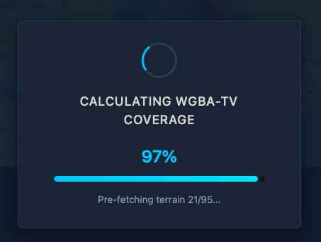
The real magic was in the pre-calculation strategy. Instead of calculating Hata losses on-demand (which meant fetching terrain data for every bearing every time), I pre-fetch and cache everything during the loading screen:
// Module-level cache for terrain data (persists across model switches)
let bearingTerrainCache = new Map();

// IMPORTANT: Don't clear terrain cache when switching models!
// Terrain doesn't change - only the propagation formula changes
function clearTheoreticalCache() {
    theoreticalCache.clear();
    cachedStationId = null;
    // bearingTerrainCache stays - terrain data is reused across models
}

// Pre-fetch terrain for all bearings DURING the loading screen
async function prefetchTerrainForGraphData(station, data, onProgress) {
    // Find all unique bearings from the drive test CSV data points
    const uniqueBearings = new Set();
    for (const row of data) {
        const bearing = calculateBearing(
            station.Latitude, station.Longitude,
            parseFloat(row["GPS Lat"]), parseFloat(row["GPS Long"])
        );
        uniqueBearings.add(Math.round(bearing));
    }

    console.log(`Pre-fetching terrain for ${uniqueBearings.size} unique bearings...`);

    // Fetch terrain for each bearing
    // Originally tried 15 concurrent API calls - crashed the server
    // Reduced to 3 concurrent - slower but reliable
    let completed = 0;
    const total = uniqueBearings.size;

    const promises = Array.from(uniqueBearings).map(bearing =>
        terrainApiSegments(station.Latitude, station.Longitude, bearing, 150)
            .then(result => {
                bearingTerrainCache.set(bearing, result.segments || []);
                completed++;
                if (onProgress) onProgress(completed, total);
            })
    );

    await Promise.all(promises);
    console.log(`Pre-fetch complete: ${bearingTerrainCache.size} bearings cached`);

    // NOW pre-calculate Hata results so they're ready instantly
    await precalculateHataResults(station, data);

    return bearingTerrainCache.size;
}

// Pre-calculate Hata signal values during loading
// So when user switches FSPL → Hata, it's instant
async function precalculateHataResults(station, data) {
    if (!station || !data || data.length === 0) return;

    console.log('Pre-calculating Hata signal values...');

    const savedModel = propagationModel;
    propagationModel = 'hata';

    try {
        await calculateTheoreticalSignalAsync(station, data);
        console.log('Hata pre-calculation complete - results cached');
    } catch (e) {
        console.warn('Hata pre-calculation failed:', e.message);
    }

    propagationModel = savedModel;  // Restore original model
}
The loading flow ties it all together. The progress bar shows terrain pre-fetching from 96% to 99%:
// In displayStationOnMap(), after coverage polygon renders:

// Step 5: Pre-fetch terrain for graph data (so Hata graph loads instantly)
if (typeof prefetchTerrainForGraphData === 'function' && appData.length > 0) {
    try {
        const terrainProgress = (completed, total) => {
            if (typeof updateProgress === 'function') {
                const pct = 96 + (completed / total) * 3;  // 96% → 99%
                updateProgress(pct, `Pre-fetching terrain ${completed}/${total}...`);
            }
        };
        await prefetchTerrainForGraphData(selectedStation, appData, terrainProgress);
    } catch (prefetchError) {
        console.warn('Terrain pre-fetch failed:', prefetchError.message);
    }
}
Results
| Before | After |
|---|---|
| 60MB NLCD file on frontend | All processing on backend |
| 8 minute load time | ~10 second load time |
| Switching FSPL → Hata: 5-10 second delay | Instant (pre-calculated) |
| 15 concurrent API calls → crashes | 3 concurrent → reliable |
| Terrain cache cleared on model switch | Cache persists |
That's a 98% reduction in load time.
There's still more optimization work to be done that I'm currently working on, but I'll share that in Part 2.
The Full Picture
What the tool does now:
- Accurate data display with ~5-10 dB precision
- FSPL and Hata-Okumura propagation models (toggle between them instantly)
- Directional antenna pattern support from FCC data
- Terrain-aware propagation using NLCD classification
- Additive terrain attenuation with per-km coefficients
- Multi-tier ATSC 3.0 analysis (L1B, L1D, PLP MER)
- Signal strength coverage predictions (dBm gradient zones)
- Video quality/bitrate coverage zones
- Drive test data overlay with station comparison
- LTTB-downsampled time series graphs
- Topological color scheme from colorbrewer
- Fast analysis presets
- Runs entirely in a web browser, no specialized software needed
Tech stack: Vanilla JavaScript (no frameworks) for calculations and UI, Google Maps API for mapping, Chart.js for graph rendering, Bootstrap for styling, Python API backend, NLCD terrain database (reduced to 60MB), FCC broadcast station database, custom propagation calculation engine.
Limitations & Caveats
Being transparent about what this tool does NOT do:
- Terrain elevation is approximated. NLCD gives land cover type, not actual elevation profiles. Hills and mountains aren't modeled, only whether the land is urban, suburban, rural, or forested.
- Hata-Okumura has valid ranges. The model was empirically derived for 1-20km (extended to 100km), 150-1500 MHz, and 30-200m transmitter heights. Outside these ranges, accuracy degrades.
- No atmospheric modeling. Weather, temperature inversions, and ducting effects aren't accounted for.
- No interference analysis. Co-channel and adjacent-channel interference from other stations isn't modeled yet.
- Terrain bias was manually calibrated. The attenuation-per-km coefficients (0.8 dB/km urban, 0.4 dB/km forest, etc.) were tuned against drive test data from specific areas. They may not generalize perfectly to all regions.
What This Taught Me
A coworker told me one sentence about peaks and averages, and it rewired how I think about data visualization.
Before that sentence, I was building a data display tool. After it, I was building a data analysis tool. Those are completely different things.
Start simple, iterate. FSPL was wrong. But without building the wrong thing first, I wouldn't have understood why Hata-Okumura mattered.
Real data beats theory. Drive test validation told me FSPL was lying. Without comparing to reality, I'd still be drawing pretty circles that meant nothing.
User research matters. Understanding that RF engineers care about MER over everything else (and specifically the triple-MER cascade in ATSC 3.0) shaped the entire interface.
Don't build on broken foundations. The bitrate zone failure taught me this the hard way. Fix the propagation model FIRST, then add features on top.
Performance is a feature. Correct math at 8 minutes per load is useless. Nobody waits. The pre-fetching + caching architecture matters as much as the propagation equations.
What's Next
Part 2 will cover the next round of optimizations and new features, including expanded terrain databases, interference analysis, and more sophisticated ModCod selection algorithms.
If you have any questions, reach out. I'll try to answer everyone.
Want to see the tool in action? Check it out at avateq.com/logreader.
Keep learning.
Keep growing.
Keep building.
Till Next Time!
George Babakhanov
Student for Life
P.S. I'm writing this Feb 09 2026... I found a better model and currently creating a integrated function that will take in everything together!
P.P.S I'm writing this Feb 27 2026, part 2 is coming out soon!
Credits & Resources
- FCC Broadcast Station Database - Station data (ERP, HAAT, channel, coordinates)
- FCC Antenna Pattern Data - Directional antenna patterns
- NLCD (National Land Cover Database) - Terrain classification data
- colorbrewer2.org - Cartographic color palettes
- AVS Forum - ATSC 3.0 community knowledge and broadcast engineering discussions
- EverythingRF FSPL Calculator - Free Space Path Loss reference calculations
- EverythingRF Watt to dBm Converter - Power unit conversion reference
- Desmos Graphing Calculator - Visualizing and validating propagation formulas
- ScienceDirect: Thermal Noise Power - Thermal noise floor reference
- ETSI EN 302 307 - DVB Second Generation framing structure, channel coding and modulation systems